
Ahmad Syaqiel Mohd Ashri (0338345)
Design Principles
Exercises and Projects
Final Project
For our final project, the idea was very vague. This meaning that, our project would be inspired by looking at billboards around Malaysia. From looking at billboards our idea's could be anything such as making an actual billboard, a piece representing visual pollution, a window to another world etc. Below are some pictures of billboards I have seen on my daily commute.
 |
| Billboard 1 (Above) |
 |
| Billboard 2 (Above) |
 |
| Billboard 3 (Above) |
 |
| Sketches for final project (Above) |
I had three ideas that were based on billboards. The first was about portraying visual pollution. The second idea was based around consumerism and how ads sexualise women's bodies.Lastly my third idea was inspired by travel billboards seen at the airport. This idea was of a man jumping through a "portal" from a blank boring world into a vibrant colorful fun world. I explored the first idea being the top left sketch with the idea being billboards radiating signals causing an overlap. These overlapped lines were cross over the road seen in the middle causing a danger for cars as they would be distracted by the "noise" of the billboards. I then tried digitizing this idea but felt it did not turn out as well as I thought, so I went to my second idea. This exploration of the first idea is seen below.
Exploring my second idea, I become settled on continuing with this one as I felt very strongly towards it. The process behind this piece was to first take pictures of ads and sale signs to place on a womans body. I had also taken a picture of a girl who I would overlay the ads on. These raw images are seen below.
Once I got the images together I placed them within Photoshop. First I started with the girl, masking out her background. From there I desaturated her as I would be overlaying the ads on top of her. I also put a stroke around her as I felt would bring more focus to her though this would later be removed in in the final piece. I then took a different image of the girl and repeated her to make her the "viewers". The reason the "viewers" are the same person is because I had wanted to create repetition within the audience to portray the crowd as one big boring grey mass. The real focus would be the advertisement girl. After creating the crowd, I overlayed the ads and did a few touch ups till it resulted in the final piece. The black circle with the lines coming from it was to ground the advertisement girl but also have the lines be movement from her towards the audience as shes the message. I also slimmed her waist a little bit to imply further sexualisation. The theme of consumerism and sexualisation is further shown as the sale signs and store signs are placed on top of the girl, creating the meaning that she is an object, and being treated as one.
For this final project, the principles I had used were repetition, contrast, lines, scale, perspective and asymmetry. Repetition was used through the "audience". Contrast was created through the bright colored ads in comparison to the dull gray of the rest of the image. Lines can be seen coming from the circle used to create movement of the eyes from the girl to the audience. Scale and perspective are used together as the girl is larger because she is closer to us while the audience is smaller because they are further and also blurred out resulting in scale and perspective. Lastly the image is asymmetrical and it is not able to be cut perfectly in half as one arm is up for the girl.
Project 2: A Sense of Place
The idea behind the second project was to get the sense of a place through any medium we had wanted. Examples of works that I looked at to understand this idea can be seen below.
As I have the most experience in photoshop, I used photos taken and altered them within photoshop. The place I had chosen was KLCC. From this location, my goal was to create a feeling of confusion and a sense of being packed. This is because I feel that malls such as KLCC are always packed and in a way confusing to walk around. From hearing the project I instantly, knew I had wanted to work around escalators or stairs. Below are the starting sketches that used to get an idea of photos needed later on.
After getting an idea of what I had wanted to do, I went to KLCC and took multiple photos of the escalators from difference perspectives. The main photos I have used in my work are seen below.
From getting the pics, I transferred the photos into photoshop. I masked the photos so only the escalators were seen and moved them around till I got a composition I liked. My works were inspired by the piece Relativity by MC Escher because I believe his work also gave a sense of confusion.
I have created three artworks. I tried to avoid white space to get that feeling of a packed place. I believe all three works give that sense. For the first piece, I tried to create an endless loop and overlayed the green arrows from the escalators to give more color but also to create further confusion with all the directions. For the second piece, I put the escalators crossing over to create multiple directions, for a maze like feeling. I then overlayed a close image of the escalator for further relay escalator motif. I then colored the white space yellow to continue this motif. For the third piece, I overlayed a color to saturate the image because I felt the colors were muted and to also create more focus on the escalators. The principles I used within my pieces, are pattern, repetition, lines and contrast.
Feedback:
Project 1: Self Portrait
For our first project we were to create a self portrait using any medium we liked. Before starting we were shown self portraits to help us further understand what we could do, and to expand our definition of a self portrait. Examples of self portraits are shown below. These examples vary in their style and their definition of a self portrait.
For my project, I decided to do it on Photoshop because I believe I could express myself. Sketches can be seen below of the ideas I had.
I went with the idea of things coming out of my head. The final piece can be seen below. I wanted to express there is a lot of thoughts going on in my head because I tend to overthink a lot.
As for myself in the piece, I made myself white with no pupils to create more attention to whats going on with my head and to say that these thoughts are what make me in a way. I then added lines around the subject to create a further focus on the "cloud". Lastly I added texture over myself and the cloud because I wanted to bring more depth compared to the background of flat white. This goes especially for the image of me because at first it was white and melted into the background. With texture it was brought out a lot more but was still subtle enough that the main focus were all the colors. The color choice started off with a pastel theme of greens reds and yellows but with the added texture it altered the color slightly. I started with a pastel theme so the colors would in a way blend together meaning the thoughts are blending together as one mess.
Feedback: The feedback gained from the critique session was that I did really well on translating what I was trying to say because how cramped all the "thoughts" were.
Lesson 7: Rhythm, Movement and Harmony
For our final exercise we were taught about rhythm, movement and harmony. Rhythm has been touched upon before when talking about pattern but to further explain it, rhythm in art is how it is in music. It is a tempo created by the elements of a piece. As for movement, it is as it's namesake, an act of moving in a piece. This can be done through many ways such as multiple figures to make the movement. Lastly harmony is a sense of unity in a piece made by the composition of elements. Examples that were brought up in the lecture to help understand these principles were a piece by Yayoi Kusama and also The Great Wave of Kanagawa. These can be seen below. Other examples I found after the lecture was Starry Night by Van Gogh and pieces by Jackson Pollock. These can also be seen below.
We were to do our own piece based off these principles. For me, I wanted to do something around movement. When thinking about movement, to me its like the frames of an animation all put onto one page. So that is where my ideas began. Below are sketches I made to plan how I would do the piece.
After that, I used newspaper to create the pieces I would place in my exercise. I did this because I felt it was an interesting texture to it. This final piece can be seen below. I had placed a sun and a tree I found within the newspaper to fill in the space and give it a bigger setting instead of an empty paper. The movement I was going for, was two movements. One movement is of the paper being folded into a plane while the other is the paper airplane being flown up until it eventually crashes into the ground resulting in it crumpling.
Feedback: What I was told by my class was that the movement was clear but the background was quite bland as a lot of it was white space.
Lesson 6: Dot, Line, Scale and Size
This week we were taught about dots, lines, scale and size by a classmate. There is no need to explain what a dot is but more over its effects with placement. If dot is centered, it exudes a sense of calmness in comparison to the side where it exudes a sense of tension. This can also go for lines depending how lines are illustrated whether they are smooth or rough etc. Lastly scale and size play off each other for scale if the sizing of one element to another. Famous examples of some of these elements can be seen below.
After learning, we were to make are own piece using one or more of the elements we learnt. I based my own piece off line work I've seen before which can be seen below.
For my work I had wanted to play around with one line drawings. Which resulted in the four figures seen in my artwork of roses, a skull and a face. I added some minor detail within the figures because they had appeared too minimalist for my liking. I then drew lines directing towards the four figures to create a larger focus on them.
Feedback: The feedback I had gained was that it was so minimalist, that it had appeared that I put minimal effort into the piece. I was told to maybe next time play around with the weight of the lines and try adding a bit more detail where I can.
Lesson 5: Hierarchy, Alignment and Perspective
During the 6th week, Miss. Sherry taught the class and I about hierarchy, alignment and perspective. Hierarchy is the order in which information is displayed. For example in a newspaper, the hierarchy starts from the top due the large headline that leads into the small body text. Alignment is the way in which a design element is directed towards to, this can be vertical, horizontal or diagonal. Lastly perspective encompasses the background and foreground of an image instead a flat 2D landscape. An example of hierarchy can be seen below within the New York poster, using the colors to create an order of information. A famous example of perspective within art is The Last Supper seen below as it is not a flat image but creates the sense of the room.
I had also found an example of perspective and hierarchy on my own. One from the packing of Fiji water and the other from a comic poster I own. These can be seen below. The Fiji water demonstrates hierarchy through its use of sizing of type and contrast with the rest of the design. This allows that the first thing you read is Fiji and then natural artesian water. While the deadpool poster demonstrates perspective due to its use of depth with the tank barrel creating perspective with forward and background dimensions.
After learning about the principles for the week, we were to take photos and alter them in Photoshop to create artwork with one of the principles learnt. I ended up creating two artworks because I enjoyed using the tools found within Photoshop. The first one demonstrates hierarchy and alignment while the other demonstrates perspective and alignment.
The idea behind the first artwork was that I was trying to create this idea of symbiosis between nature and civilization through the use of the water and plants compared to the one building. The second picture at first was a simple experiment with the tools within Photoshop but in the end, I thought of the spheres as planets aligned within a solar system.
Feedback: The feedback gained for artwork 1, was that the building feels out of place along with the plants and that it would be stronger without. As for artwork 2, the feedback gained was that people found it very interesting but it was questioned whether the black bars were necessary.
Lesson 4: Pattern, Repetition and Texture
The 4th week of the module, my classmates and I were tasked with teaching the rest of the class about pattern, repetition and texture. As said within the presentation, pattern is the repetition of design elements. Repetition is as its name implies, a repetition of an element. Lastly for texture, there are two forms of texture which we taught about, physical and visual texture. Physical texture is the is what we can feel with our sense of touch while visual texture is the illusion of physical texture. Examples we showed within our presentation were local Malay patterns such as a traditional piece of clothing that I had brought to the class, a piece by MC Escher as well as other works by other artists. There are also patterns that I found in my everyday life.
The exercise for this principle was to make a pattern of our own through printmaking. My process to arrive to what would be the final piece was simply to experiment with different materials such as a fork, a carved out carrot and other objects I had brought with me. This experimentation can be seen within the three photos below as I tested what worked and what didn't.


Eventually I settled on what I had liked and used a plastic lid for a cup and repeated it through out the page, using the color blue and red. After that, the piece still felt empty so I used put my thumbprint through the gaps in yellow to fill the space. The piece can be seen below.
Feedback: Feedback I had gained was that the overall pattern that I had created was interesting, especially with the use of a plastic lid. The problems with it was that there was white spaces that I had not successfully filled in such as the bottom left.
wREGA Annual General Meeting
On Saturday morning, wREGA held their annual general meeting. Within this meeting there were three speakers; Chong Yan Chuah, Paul Koh, and Keith Song with his partner Teoh Khaw Swee. These three speakers all did something different when it comes to design whether it be motion graphics, wire jewelry or a new approach to branding . It was interesting to see how design can be so broad yet share similar aspects. Especially how their designs served a purpose to the audience. To me, the most captivating was definitely the motion graphics designer, due to the overall visuals and how he blended this world he had created with the audio. I really enjoyed the story it attempted to tell. I was very drawn in to it.
Lecture 3: Symmetry, Asymmetry and Balance
For week 3, the principles of symmetry, asymmetry and balance were taught by my peers. Symmetry and asymmetry are a part of balance, for balance is the even distribution of values in a piece through numerous elements. Symmetry is the balance of elements evenly which allow it to be reflected, like a mirror and show the same image. While asymmetry is the lack of even balance within the elements. Examples of these two can be seen below.


To further prove our understanding of these concepts we were tasked with creating a piece using watercolors to depict one of these principles. Below are my ideas on what this piece would look like. With me ultimately choosing the bottom left design with some alterations. The bottom left design was inspired by two artists that I follow on Instagram who are @dobu.haishen and @jor.ros. Their works can also be seen below.
After choosing one of my ideas, I tried to incorporate further balance to it, through colors and details surrounding the figure. The final piece can be seen below.
Feedback: The critique that I had received was that the overall idea was unique but even though I tried to maintain balance with the use of colors, it doesn't necessarily mean it is, due to how much there is of one color. Furthermore the balancing of the subject with the money was also talked about due to the spacing, especially in the middle left side of the page feeling empty.
Lecture 2: Gestalt
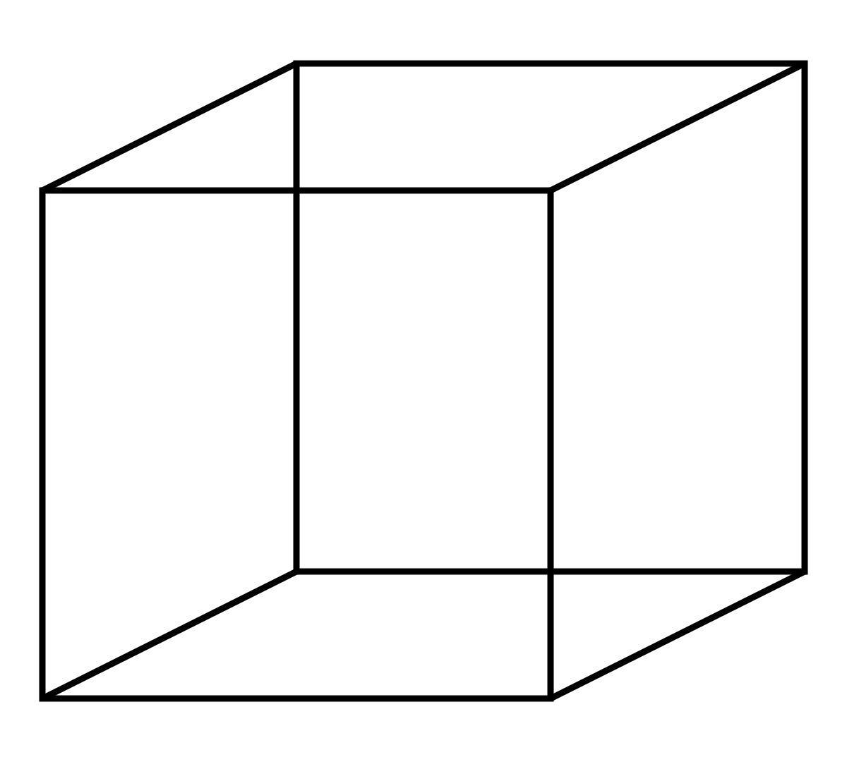
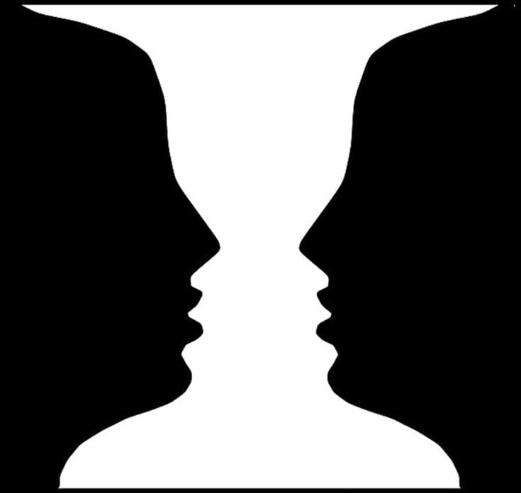
Within week 2, we were taught about gestalt. Gestalt is when there is another image visible through the use of negative space, such as an illusion for example. The most famous example being Rubin's glass. Another example is Necker's cube. Both of these examples are seen below.
Lecture 1: Contrast
For the first lecture taught to us in class, I was absent. Though to my understanding contrast refers to the juxtaposition of elements. The effect of the juxtaposition allows for the designer to grasp the attention of the viewer due to the opposing components. Examples of contrast could be through opposing colors, sizes, shapes, etc. Through research, below are two images that I believe aid in showing contrast and its effect on the viewer and below those are images I believe show contrast too.




To further understand contrast, we were assigned to create our own piece that would use contrast to show our understanding of the concept. At first I had many ideas on the piece I wanted to create ranging from: comic book characters, a city skyline or a bomb going off. After sketching out the ideas as seen below.
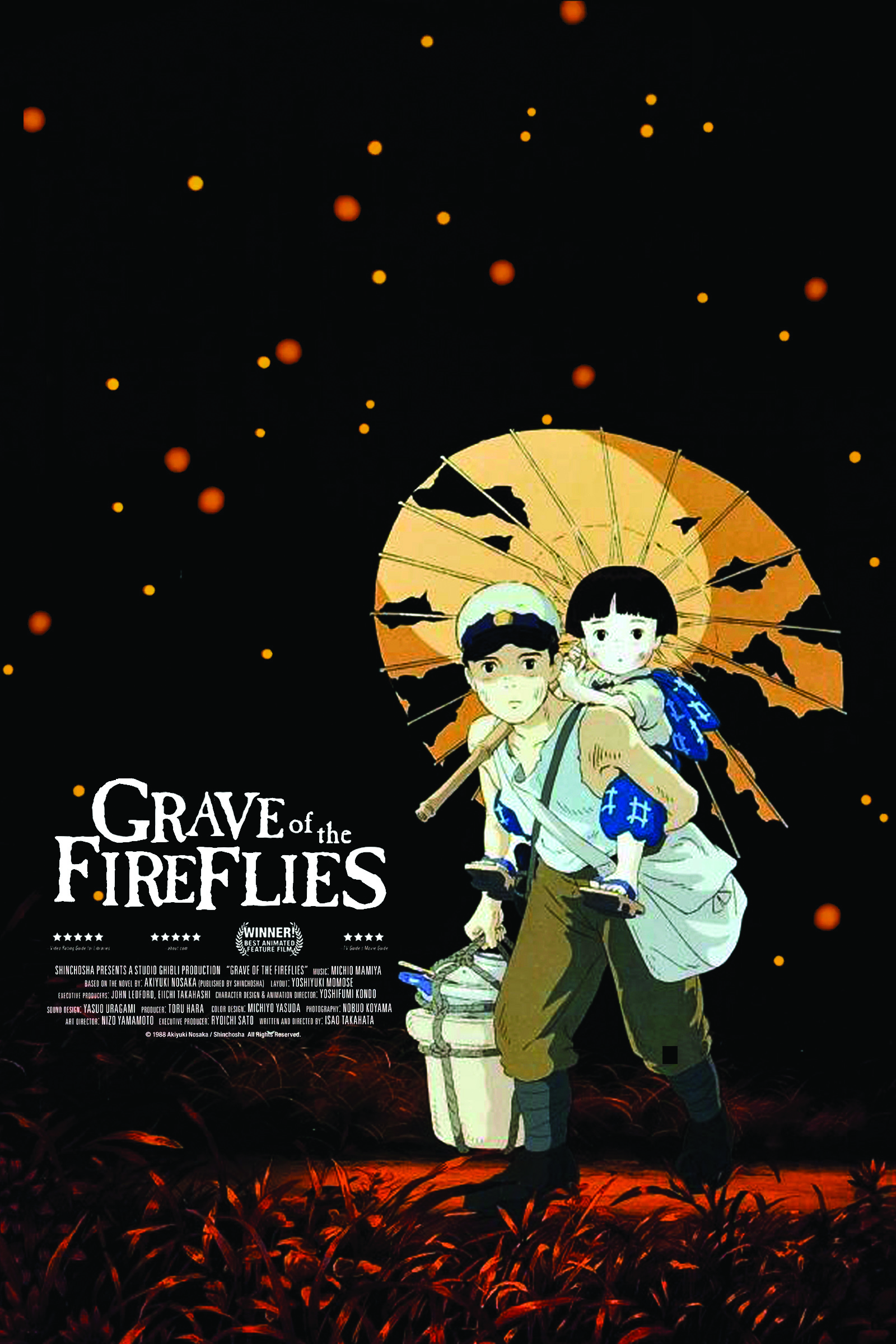
I settled on focusing on the bomb idea. This idea was inspired by Japanese animated films I had seen, such as Akira by Katsuhiro Otomo and Grave of the Fireflies by Isao Takahata.

Further exploring my bomb idea I had decided to place a person within the bombing for I sought to create a sense of dread and shock, as one would react to a bombing. I experimented with how the person would look within the bombing, from having a skeleton fall apart into pieces to showing a mans clothes being torn apart to reveal his/her's skeleton. Within the end I simply settled on having a plain skeleton in a dramatic pose. This was chosen for I feel with too many details, the scene created would lose the attention that I sought within the piece.
Within the final piece, contrast is shown through the opposing elements of color and size. Color through the opposing black of the skeleton and the background. As for the size, there is contrast within the size of the mushroom cloud to the size of the skeleton within it.
Feedback: The feedback I received about my contrast piece was that the piece if covering the skeleton, it would be symmetrical. This meaning the piece was grounded and well balanced. With the piece being in the center it also had made the piece rigid and strong. The cutting of the details within the skeletons fingers were rough but in a way helped with the piece.
 |
| Exploration of idea 1 (Above) |
 |
| Ad 1 (Above) |
 |
| Ad 2 (Above) |
 |
| Sale sign 1 (Above) |
 |
| Girl 1 (Above) |
 |
| Girl 2 (Above) |
 |
| Sale sign 2 (Above) |
 |
| Sale sign 3 (Above) |
 |
| Sale sign 4 (Above) |
 |
| Store sign 1 (Above) |
 |
| Store sign 2 (Above) |
 | |
|
 |
| Store sign 4 (Above) |
 |
| Store sign 5 (Above) |
 |
| Store sign 6 (Above) |
 |
| Sale sign 5 (Above) |
 |
| Store sign 7 (Above) |
Once I got the images together I placed them within Photoshop. First I started with the girl, masking out her background. From there I desaturated her as I would be overlaying the ads on top of her. I also put a stroke around her as I felt would bring more focus to her though this would later be removed in in the final piece. I then took a different image of the girl and repeated her to make her the "viewers". The reason the "viewers" are the same person is because I had wanted to create repetition within the audience to portray the crowd as one big boring grey mass. The real focus would be the advertisement girl. After creating the crowd, I overlayed the ads and did a few touch ups till it resulted in the final piece. The black circle with the lines coming from it was to ground the advertisement girl but also have the lines be movement from her towards the audience as shes the message. I also slimmed her waist a little bit to imply further sexualisation. The theme of consumerism and sexualisation is further shown as the sale signs and store signs are placed on top of the girl, creating the meaning that she is an object, and being treated as one.
 |
| Process of final piece 1 (Above) |
 |
| Process of final piece 2 (Above) |
 |
| Process of final piece 3 (Above) |
 |
| Process of final piece 4 (Above) |
 |
| Process of final piece 5 (Above) |
 |
| Process of final piece 6 (Above) |
 |
| Process of final piece 7 (Above) |
 |
| Process of final piece 8 (Above) |
 |
| Process of final piece 9 (Above) |
 |
| Process of final piece 10 (Above) |
 |
| Final piece for final project (Above) |
The idea behind the second project was to get the sense of a place through any medium we had wanted. Examples of works that I looked at to understand this idea can be seen below.
 |
| A sense of place by Michael Burrows (Above) |
 |
| A sense of place by Clare Finn (Above) |
 |
| A sense of place by Claudette Losier (Above) |
 |
| A sense of place by Cate Field (Above) |
As I have the most experience in photoshop, I used photos taken and altered them within photoshop. The place I had chosen was KLCC. From this location, my goal was to create a feeling of confusion and a sense of being packed. This is because I feel that malls such as KLCC are always packed and in a way confusing to walk around. From hearing the project I instantly, knew I had wanted to work around escalators or stairs. Below are the starting sketches that used to get an idea of photos needed later on.
 |
| Sketches for a sense of place piece (Above) |
 |
| Photos assets for piece taken by me (Above) |
 |
| Photos assets for piece taken by me (Above) |
 |
| Photos assets for piece taken by me (Above) |
 |
| Photos assets for piece taken by me (Above) |
 |
| Photos assets for piece taken by me (Above) |
From getting the pics, I transferred the photos into photoshop. I masked the photos so only the escalators were seen and moved them around till I got a composition I liked. My works were inspired by the piece Relativity by MC Escher because I believe his work also gave a sense of confusion.
/s3/static.nrc.nl/wp-content/uploads/2014/11/1511tzeschergroot31.jpg) |
| Relativity By MC Escher (Above) |
 |
| A Sense of Place 1 Final (Above) |
 |
| A Sense of Place 2 Final ( Above) |
 |
| A Sense of Place 3 Version 1 (Above) |
 |
| A Sense of Place 3 Final (Above) |
Project 1: Self Portrait
For our first project we were to create a self portrait using any medium we liked. Before starting we were shown self portraits to help us further understand what we could do, and to expand our definition of a self portrait. Examples of self portraits are shown below. These examples vary in their style and their definition of a self portrait.
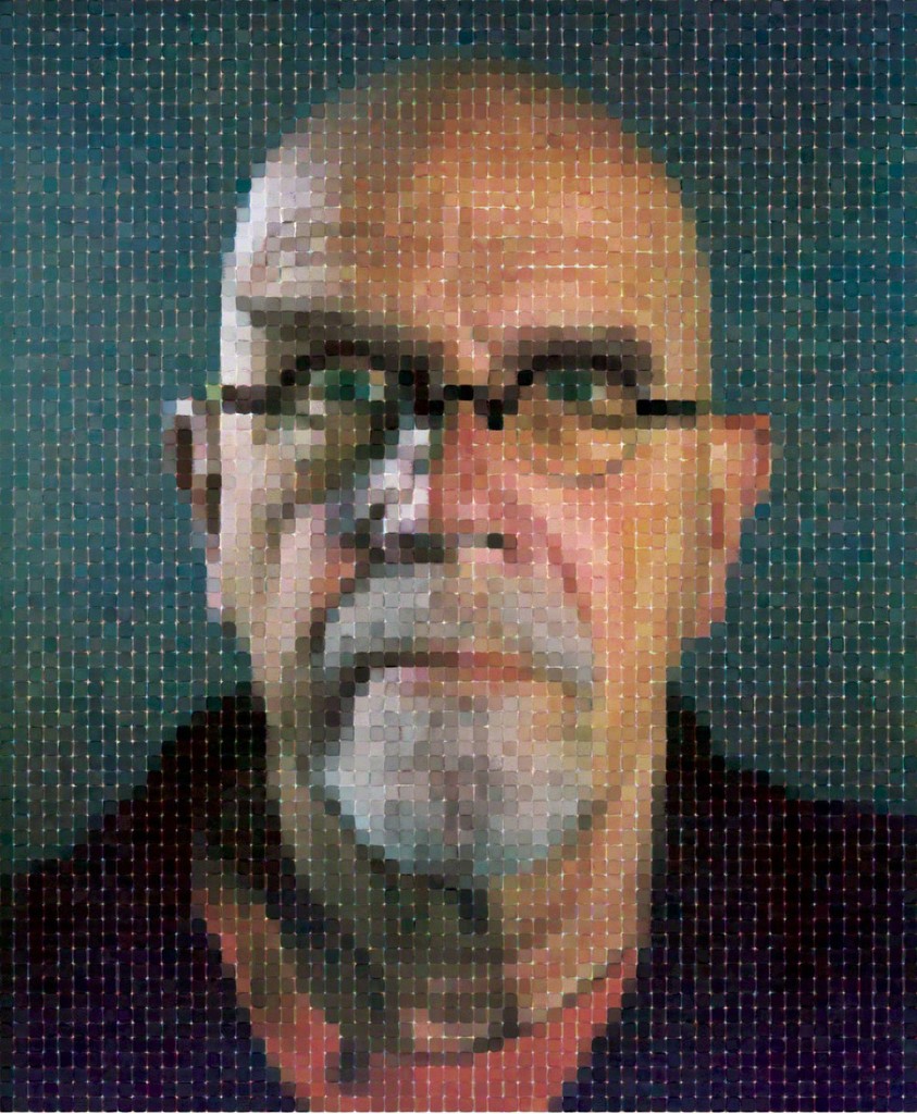 |
| Self Portrait of Chuck Close (Above) |
 |
| Self Portrait of Van Gogh (Above) |
 |
| Self Portrait of Basquiat (Above) |
 |
| Self Portrait of Frida Kahlo (Above) |
For my project, I decided to do it on Photoshop because I believe I could express myself. Sketches can be seen below of the ideas I had.
 |
| Sketches for self portrait ideas (Above) |
I went with the idea of things coming out of my head. The final piece can be seen below. I wanted to express there is a lot of thoughts going on in my head because I tend to overthink a lot.
 |
| Final self portrait piece (Above) |
As for myself in the piece, I made myself white with no pupils to create more attention to whats going on with my head and to say that these thoughts are what make me in a way. I then added lines around the subject to create a further focus on the "cloud". Lastly I added texture over myself and the cloud because I wanted to bring more depth compared to the background of flat white. This goes especially for the image of me because at first it was white and melted into the background. With texture it was brought out a lot more but was still subtle enough that the main focus were all the colors. The color choice started off with a pastel theme of greens reds and yellows but with the added texture it altered the color slightly. I started with a pastel theme so the colors would in a way blend together meaning the thoughts are blending together as one mess.
Feedback: The feedback gained from the critique session was that I did really well on translating what I was trying to say because how cramped all the "thoughts" were.
Lesson 7: Rhythm, Movement and Harmony
For our final exercise we were taught about rhythm, movement and harmony. Rhythm has been touched upon before when talking about pattern but to further explain it, rhythm in art is how it is in music. It is a tempo created by the elements of a piece. As for movement, it is as it's namesake, an act of moving in a piece. This can be done through many ways such as multiple figures to make the movement. Lastly harmony is a sense of unity in a piece made by the composition of elements. Examples that were brought up in the lecture to help understand these principles were a piece by Yayoi Kusama and also The Great Wave of Kanagawa. These can be seen below. Other examples I found after the lecture was Starry Night by Van Gogh and pieces by Jackson Pollock. These can also be seen below.
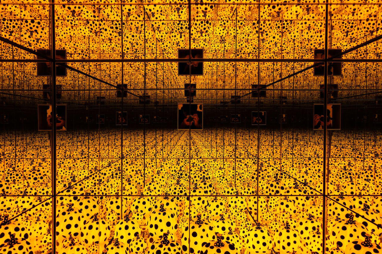 |
| Infinity Mirror by Yayoi Kusama (Above) |
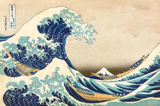 |
| The Great Wave of Kanagawa (Above) |
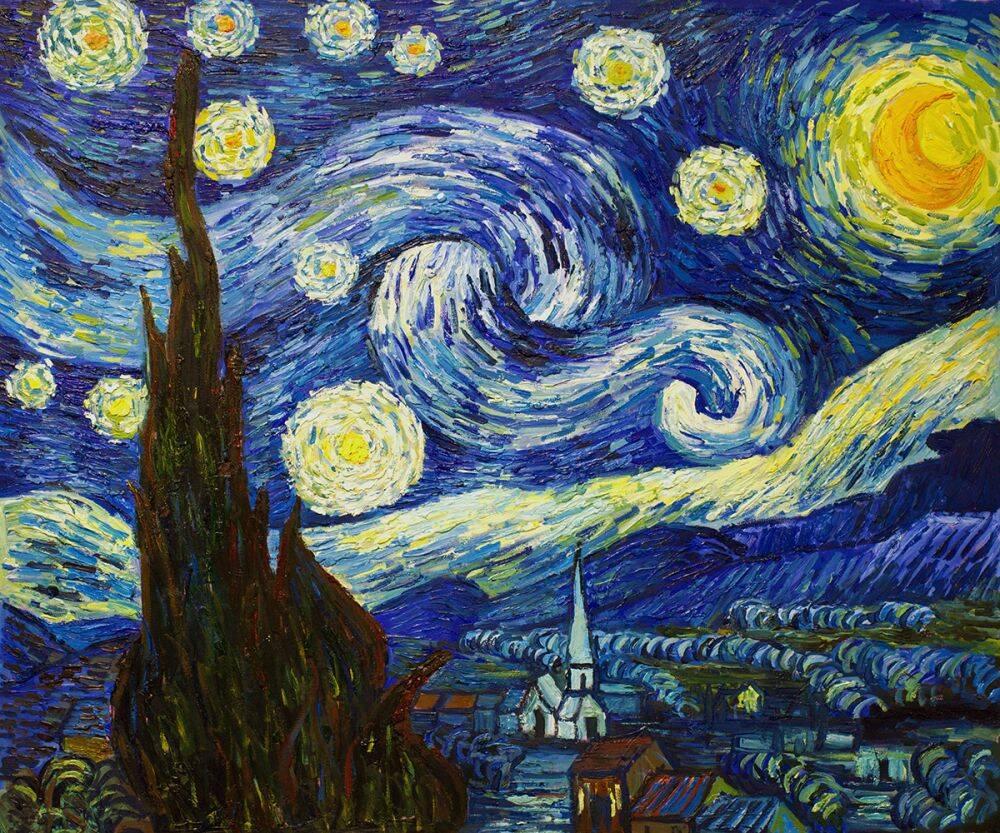 | ||
Starry Night by Van Gogh (Above)
|


 |
| Rough sketches for movement piece (Above) |
After that, I used newspaper to create the pieces I would place in my exercise. I did this because I felt it was an interesting texture to it. This final piece can be seen below. I had placed a sun and a tree I found within the newspaper to fill in the space and give it a bigger setting instead of an empty paper. The movement I was going for, was two movements. One movement is of the paper being folded into a plane while the other is the paper airplane being flown up until it eventually crashes into the ground resulting in it crumpling.
 |
| Final movement piece (Above) |
Feedback: What I was told by my class was that the movement was clear but the background was quite bland as a lot of it was white space.
Lesson 6: Dot, Line, Scale and Size
This week we were taught about dots, lines, scale and size by a classmate. There is no need to explain what a dot is but more over its effects with placement. If dot is centered, it exudes a sense of calmness in comparison to the side where it exudes a sense of tension. This can also go for lines depending how lines are illustrated whether they are smooth or rough etc. Lastly scale and size play off each other for scale if the sizing of one element to another. Famous examples of some of these elements can be seen below.
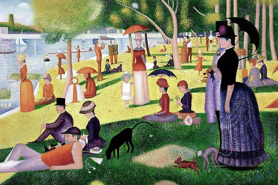 |
| A Sunday Afternoon on the Island of La Grande Jatte by Georges Seurat (Above) |
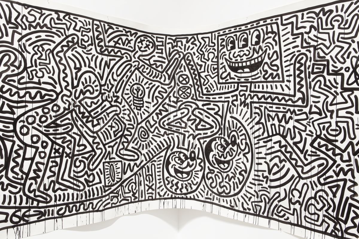 |
| Piece by Keith Haring (Above) |
 |
| Disclosure face (Above) |
 |
| Dancers by Keith Haring (Above) |
 |
| Final lines piece (Above) |
Feedback: The feedback I had gained was that it was so minimalist, that it had appeared that I put minimal effort into the piece. I was told to maybe next time play around with the weight of the lines and try adding a bit more detail where I can.
Lesson 5: Hierarchy, Alignment and Perspective
During the 6th week, Miss. Sherry taught the class and I about hierarchy, alignment and perspective. Hierarchy is the order in which information is displayed. For example in a newspaper, the hierarchy starts from the top due the large headline that leads into the small body text. Alignment is the way in which a design element is directed towards to, this can be vertical, horizontal or diagonal. Lastly perspective encompasses the background and foreground of an image instead a flat 2D landscape. An example of hierarchy can be seen below within the New York poster, using the colors to create an order of information. A famous example of perspective within art is The Last Supper seen below as it is not a flat image but creates the sense of the room.
 |
| Hierarchy Poster (Above) |
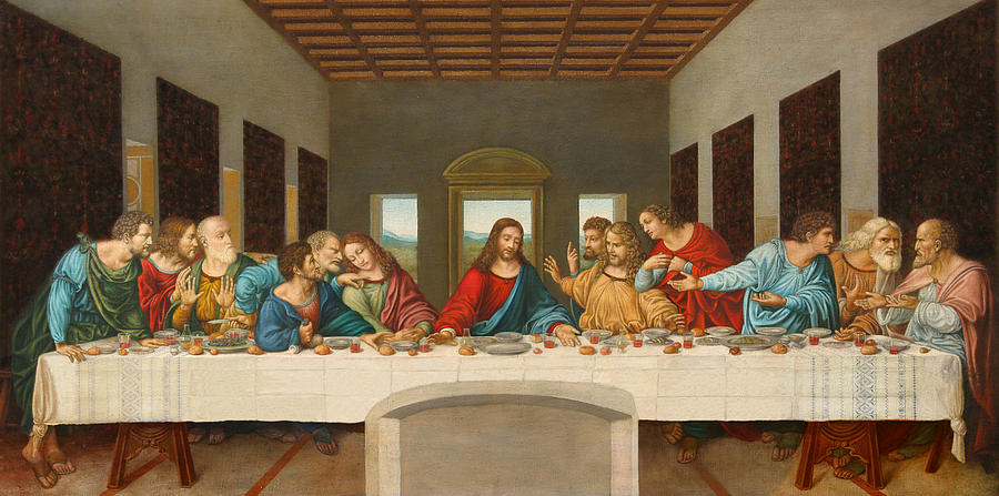 |
| The Last Supper (Above) |
 |
| Deadpool poster demonstrating perspective(Above) |
 |
| Fiji water demonstrating hierarchy(Above) |
 |
| Artwork 1 (Above) |
 |
| Artwork 2 (Above) |
Feedback: The feedback gained for artwork 1, was that the building feels out of place along with the plants and that it would be stronger without. As for artwork 2, the feedback gained was that people found it very interesting but it was questioned whether the black bars were necessary.
Lesson 4: Pattern, Repetition and Texture
The 4th week of the module, my classmates and I were tasked with teaching the rest of the class about pattern, repetition and texture. As said within the presentation, pattern is the repetition of design elements. Repetition is as its name implies, a repetition of an element. Lastly for texture, there are two forms of texture which we taught about, physical and visual texture. Physical texture is the is what we can feel with our sense of touch while visual texture is the illusion of physical texture. Examples we showed within our presentation were local Malay patterns such as a traditional piece of clothing that I had brought to the class, a piece by MC Escher as well as other works by other artists. There are also patterns that I found in my everyday life.
 |
| Piece by MC Escher (Above) |
 |
| A Batik pattern (Above) |
 |
| Pattern on my door (Above) |
 |
| Pattern on my tapestry (Above) |


 |
| Testing out materials (Above) |
 |
| Final piece for pattern exercise (Above) |
wREGA Annual General Meeting
On Saturday morning, wREGA held their annual general meeting. Within this meeting there were three speakers; Chong Yan Chuah, Paul Koh, and Keith Song with his partner Teoh Khaw Swee. These three speakers all did something different when it comes to design whether it be motion graphics, wire jewelry or a new approach to branding . It was interesting to see how design can be so broad yet share similar aspects. Especially how their designs served a purpose to the audience. To me, the most captivating was definitely the motion graphics designer, due to the overall visuals and how he blended this world he had created with the audio. I really enjoyed the story it attempted to tell. I was very drawn in to it.
 |
| The speakers (Above) |
Lecture 3: Symmetry, Asymmetry and Balance
For week 3, the principles of symmetry, asymmetry and balance were taught by my peers. Symmetry and asymmetry are a part of balance, for balance is the even distribution of values in a piece through numerous elements. Symmetry is the balance of elements evenly which allow it to be reflected, like a mirror and show the same image. While asymmetry is the lack of even balance within the elements. Examples of these two can be seen below.


Symmetric example(Left), Asymmetric example (Right)
I had also found these two examples from my own discovery. One is of symmetry I found within my shirt, the other is of a poster in my room depicting asymmetry.


Symmetric example(Left), Asymmetric example (Right)
 |
| Ideas for the symmetric/asymmetric piece (Above) |
  |
| Works by @dobu.haishen (Left) and @jor.ros (Right) |
 |
| Final asymmetrical piece (Above) |
Feedback: The critique that I had received was that the overall idea was unique but even though I tried to maintain balance with the use of colors, it doesn't necessarily mean it is, due to how much there is of one color. Furthermore the balancing of the subject with the money was also talked about due to the spacing, especially in the middle left side of the page feeling empty.
Lecture 2: Gestalt
Within week 2, we were taught about gestalt. Gestalt is when there is another image visible through the use of negative space, such as an illusion for example. The most famous example being Rubin's glass. Another example is Necker's cube. Both of these examples are seen below.
Necker's Cube (Left), Rubin's Glass (Right)
As for examples I found myself, they were found in the Formula 1 logo and the logo of my highlighter. For the Formula 1 logo, there is a hidden 1 within the negative space between F and the red streaks. As for the highlighter, the logo is a circle with waves in it but there is also a S within it.
 |
| Schneider logo (Above) |
 |
| F1 ticket featuring the logo (Above) |
After this understanding of what gestalt is, I was tasked to make a gestalt piece of my own. Starting off was a struggle for I was unsure on how I would put two images together. I thought to myself that I would do simple shapes for it would make it easier to combine into one picture. Below are my sketches for my gestalt art piece.
 |
| Rough sketches of gestalt ideas (Above) |
My two simple shapes would be silhouettes of animal. At first this started with a dog and cat but slowly evolved to what the final piece would be of a dog/wolf with a rabbit. I tried arranging these two animals in multiple ways until I found an arrangement that satisfied me. The next step was to transfer this idea to a piece of A4 and color it in with black ink. A lot of black ink was used but I think the final piece turned out alright as seen below.
 |
| Final gestalt piece (Above) |
Feedback: After the critique, feedback I had received was that understanding the piece was quite hard at a close glance but the idea was unique and different compared to other pieces shown. The message did eventually show but it took a step back for people to see the dog. As for the rabbit, people were able to see that far easier.
For the first lecture taught to us in class, I was absent. Though to my understanding contrast refers to the juxtaposition of elements. The effect of the juxtaposition allows for the designer to grasp the attention of the viewer due to the opposing components. Examples of contrast could be through opposing colors, sizes, shapes, etc. Through research, below are two images that I believe aid in showing contrast and its effect on the viewer and below those are images I believe show contrast too.
Website of Tekroc (Left), Carsonified site (Right)


Frames from an animation piece by Samantha Lee (Left), Advertising piece by Hiann Lee (Right)
To further understand contrast, we were assigned to create our own piece that would use contrast to show our understanding of the concept. At first I had many ideas on the piece I wanted to create ranging from: comic book characters, a city skyline or a bomb going off. After sketching out the ideas as seen below.
 |
| Rough ideas for contrast piece (Above) |
I settled on focusing on the bomb idea. This idea was inspired by Japanese animated films I had seen, such as Akira by Katsuhiro Otomo and Grave of the Fireflies by Isao Takahata.
Akira by Katsuhiro Otomo (Left), Grave of the Fireflies by Isao Takahata (Right)
Further exploring my bomb idea I had decided to place a person within the bombing for I sought to create a sense of dread and shock, as one would react to a bombing. I experimented with how the person would look within the bombing, from having a skeleton fall apart into pieces to showing a mans clothes being torn apart to reveal his/her's skeleton. Within the end I simply settled on having a plain skeleton in a dramatic pose. This was chosen for I feel with too many details, the scene created would lose the attention that I sought within the piece.
Within the final piece, contrast is shown through the opposing elements of color and size. Color through the opposing black of the skeleton and the background. As for the size, there is contrast within the size of the mushroom cloud to the size of the skeleton within it.
 |
| Final contrast piece (Above) |
Feedback: The feedback I received about my contrast piece was that the piece if covering the skeleton, it would be symmetrical. This meaning the piece was grounded and well balanced. With the piece being in the center it also had made the piece rigid and strong. The cutting of the details within the skeletons fingers were rough but in a way helped with the piece.
Comments
Post a Comment